VisLies 2022 Gallery
After two years of having to meet through cameras and screens, we were finally able to meet in person for VisLies again.
Not to Scale

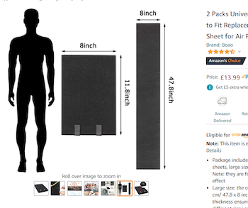
Ken Moreland started out with a fun example from an amazon.com product page for carbon filters. As with most listing, several pictures are provided for the product. One of the pictures, shown here, is dedicated to demonstrating the size and provides a silhouette of a person to help with scale.
At first glance, the filter pads look huge. The pad is nearly half the height of a person. But wait. If we look at the actual dimensions of the pad, we see that the pad is only about a foot tall. Either the sizes of the pad and the person are not to scale, or that person is only a couple of feet tall.
On top of that, there is a second view of the pad, unfolded this time. The unfolded pad is labeled at about 4 feet tall. That is clearly not at the same scale as the folded pad, and also shorter than the average adult.
None of the three items in this picture are to scale with each other, and human silhouettes are not part of what is being sold. Thus, the only function the person serves in this picture is to make the product look larger than it actually is.
Pancake Success
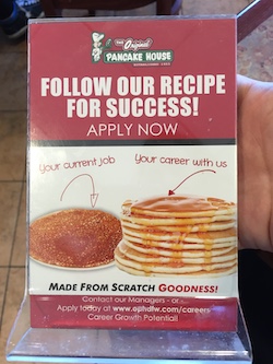
While visiting a breakfast restaurant, Ken came across this compelling advertisement to work there. It features a visualization that uses two stacks of pancakes to compare an average job with a job at the restaurant.
Using pancakes as a physical manifestation of a bar chart is not unreasonable (although the image could be better about getting the size and orientation of the pancakes more consistent). Of course, the advertisement is not actually referring to pancakes but rather a notional concept of career satisfaction. The idea that life success could be quantified in a single number, particularly when there is no way to know anything about the reader’s career, is comical.
Or maybe the advertisement is talking about physical pancakes. A pancake restaurant would almost certainly involve more pancakes than his current job. As compelling as this argument is, Ken decided to stick with his current career.
Union Pay
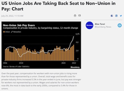
A recent article in Bloomberg Law showed this recent plot that the title claims suggests “union jobs are taking a back seat.” The plot certainly shows in recent years the non-union pay being larger than unions, but the claim struck Ken as a little odd.
The plot itself does not have anything overtly wrong with it. Although the asymmetric representation of union data (bars) and non-union (line) is a a bit strange, there is nothing particularly misleading about it. And the data time range, which goes from present back over 15 years, is not cherry picked.

The real problem here is not with the plot itself but with the title. A common subtle theme at VisLies is using a visualization to draw a conclusion that is unsupported by the data. In this case, the plot is showing the change in worker pay, not the total pay. Just because the white line is over the tan bars, it is not necessarily the case that non-union workers are paid more than union workers.
Ken wanted to take a closer look. The Bloomberg article reports that the data comes from the U.S. Bureau of Labor Statistics. Ken pulled the numbers from the same database and plotted both the change and total worker pay.
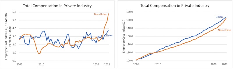
The left plot replicates that in the Bloomberg article. The right plot shows the total pay from the same database.1 As we can see in the right plot, union jobs still, on average, pay more than their non-union equivalent (for now).
Eyeing the Hurricane
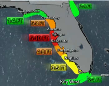
Bernice Rogowitz presented this map of Florida showing the storm surge for Hurricane Ian. The extent of the surge is shown as overlapping regions on the map and the color, presumably, indicates the height of the storm surge, since adjacent color coded labels are provided. However, if you look at the values, you can see that they don’t map onto the surge heights uniquely.
Here is a colored table to examine the ranges. The color green, for example, shows the range indicated for each region. The first green region indicates 1-4 feet, so the first row colors the cells 1-4 green, etc. 1 and 2 feet are reliably colored green, but 3 ft could be green or yellow, 4 feet could be green yellow or orange, 5 feet could be yellow, orange or red.
With the table in place it becomes a bit more clear what the colors mean. The color indicates a maximum value. So the three green regions could be at max 4 feet, so green, yellow at 5, so yellow, and orange at 8, and red at 10. But, why not say so?
Mixed up Colors
The modest scatter plot. A great way to show relationships of data in 2 dimensions. But what about more complex relationships with more measurements?
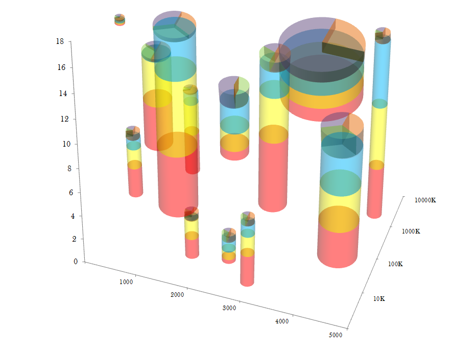
No worries! To solve these problems, Eager Pies presents the 3D Stacked Scatter Pie Columns. The scatter plot is enhanced by creating sized stacked bars in the third dimension. To maximize the amount of information, a pie chart is placed on the top of each bar.
Unfortunately, cramming all these features together is problematic. Converting the scatterplot into a 3D space makes it harder to understand their relationship to each other. 3D visualizations also bring up the problem of occlusion where one object cannot be seen because it is in front of another. This visualization gets around the occlusion problem by making the bars transparent. But as Bernice explains, transparent colors come with their own problems.
When bars overlap, you get transparent color mixture. There are 3 main values depicted (blue, yellow red), and three additional values introduced on the top section of each cylinder (green, violet, and peach). Even within a single cylinder, there are problems. The blue and yellow bars, when seen in this projection, overlap at their projected intersection, producing green. Green is an artifact and has no semantic meaning. When two bars overlap, the number of extra colors increases, totally obfuscating the numerical meaning.
Although this plot is presented in satire, it demonstrates how adding more visual elements does not always add more information. That said, unintentional color mixing can happen with the best of intentions.
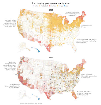
Consider these [maps of the distribution of immigrants in the United States]. Props to the designers of these maps for providing such a detailed distribution of immigrant population. Perhaps too detailed. Because these dots are so small and dense the colors blend together. This blending could be caused by subsampling of pixels, image compression artifacts, or simple natural blurring in your eye. At any rate, the color mixing yields colors like greenish hues that are not even part of the color legend.
This is because when colors mix, they do not, perceptually, retain the properties of the colors that form them. They form a completely new color. This is because, based on trichromatic theory, different mixes of light wavelengths can combine into the same colors. So, any color can be mixed with 3 primaries, but there is an infinite number of triplets that could have produced that resulting color.
Venn-ish Diagrams
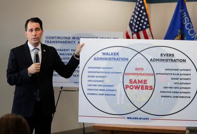
Dave Pugmire usually finds stupid things to bring to VisLies, and we love them. He started with this Venn diagram created by Scott Walker, former governor of Washington.
Well, we use the term “Venn diagram” loosely here. This thing looks like a Venn diagram, and is clearly supposed to be one. But it is not. A Venn diagram is supposed to represent things that belong exclusively to one set, exclusively to the other set, and then the intersection of things that belong to both sets. But look at the lists in the two sides of the diagram. They list the exact same things. So this diagram shows the things common to both in the middle and then the things that are common to both on the left and things that are common to both on the right.
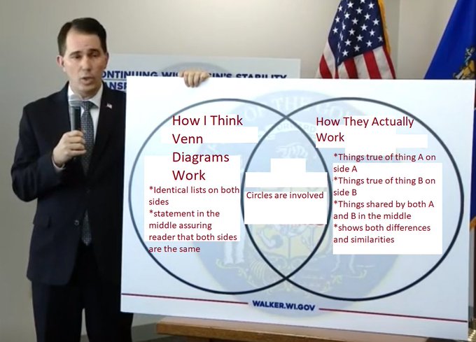
This ridiculous infographic did not go by unnoticed. Unsurprisingly, Governor Walker was roasted on social media. Along with the ridiculing came some “helpful” fixes. Here is one of our favorites from Twitter user @AgedHydrogen.
Odds are Anyone’s Guess
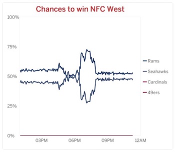
Dave also presented this graph, which was tweeted out by ESPN. The obvious problem with this plot is the color scheme. The 4 series use two shades of blue and two shades of red. The designers made the bold move to make the shades of blue and red, respectively, nearly identical. The plot becomes useless as the values become indistinguishable.
There are multiple simple corrections. The easiest is to pick 4 colors that are actually distinct, and such color schemes are available. Of course, we observe at this time that only 2 teams are eligible to win the NFC West. The other 2 teams can be simply removed from the graph. Now you only need 2 distinct colors. On top of that, since there are only 2 teams, and exactly one will win, the chances are simply inverses of each other. Thus, you could just print one of these (say, chances of the Rams winning), and that tells you everything you need to know.
You are Here
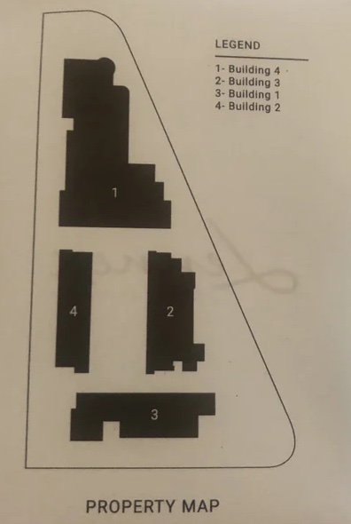
During a hotel stay, Dave noticed something strange about this property map. The 4 buildings on this map are labeled 1 through 4, which itself is not particularly strange, especially since the names of the building are the numbers 1 through 4. Given that, it seems unnecessary to have a legend.
But look more closely at the legend. The building number in the map is not the same number as the building. 1 is 4, 2 is 3, etc.
Why? Just, why?
COVID-19 Irregularities
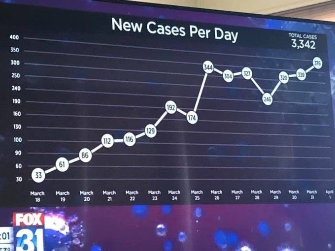
Lily Ge presented this gem of a chart. The chart is simple enough. It provides the day-to-day trends of COVID-19, compiled in the early days of the pandemic.
But look closely at the vertical axis and you will see something odd. The lines on the axis are labeled “30, 60, 90, 100, 130, 160, 190, 240, 250, 300, 350, 400.” The spacing between the numbers is entirely inconsistent. The spacing goes from 30 to 10, back to 30, then to 50.
This screen capture has made its rounds on social media and has been noticed in other blogs such as by Stephanie Glen and Victor Piercey.
We can speculate on the reasons for such shenanigans with the axis. But it is unclear what point might be made by altering the spacing. Likely this is just sloppiness.
A Feast of Pies
Pie charts and related displays are a common theme at VisLies. Apart from pie charts having some dubious features, the base metaphor and visual elements are frequently misused and abused.
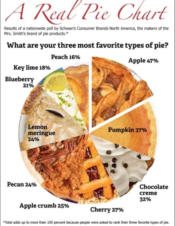
Ken Moreland identified a group of problematic pie charts. The first of these is this chart presenting the results of a survey of the North America’s favorite pies. The premise of the “real pie chart” that uses pictures of real pie slices for the wedges of the chart is cute if a little distracting.
But you might notice that the numbers do not seem to match the proportional sizes of the slices. For example, the “Apple” slice is labeled “47%”, which should be nearly half the pie. But that is clearly not the case.
The text around the chart explains why this is. The participants of the study were asked for their three favorite pies. The chart numbers are not giving the percentage of votes cast, but rather the number of participants that voted for the pie. Since each person gets 3 votes, the total percentage of votes adds up to 300%. As the fine print on the bottom says, the three votes per participants means that the total number of votes adds up to more than 100%.
Having the pie represent greater than 100% breaks the basic metaphor of the pie chart, which is showing parts of a whole. A whole is 100%, so showing the proportion of votes rather than voters would be much less confusing. But even if we were to accept the concept that the whole is 300%, the chart is still wrong. The numbers don’t add up to 300% either. They add up to 271%. People must have voted for pies that did not make this top ten list. Not listing the least significant values in a pie chart is common as too many thin slices can make the chart less readable. But when this is done, the remaining categories should be grouped into an “other” slice to ensure that the proportions of the other slices are correct.

We now take your pie and add a doughnut of nonsense. Here the numbers add up to 100%, so at least that is good. But, hey, that 1% slice looks awfully big. And why does 8% take up half of the chart?
So, yeah. None of these slices are proportional to the number. On top of that, the numbers seem suspect. How is it possible that more people are getting Master’s degrees than Bachelor’s degrees? Unfortunately, the original post doesn’t put the chart in context, and the labels are not clear enough.
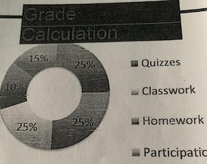
Now we see your doughnut of nonsense and remove the color. The proportions of these slices are also off. For example, the lower-left slice is clearly less than 25%.
But now the chart has been poorly copied enough times that the color is removed and it is impossible to know which number goes with which category. We also notice that the legend only has 4 categories whereas there are 5 slices. It might be the case that one of the categories got cut off the picture. In any case, both the color and the cropping would be less of an issue if the labels were placed with the chart slices themselves rather than in a separate legend.
Worthless Chart
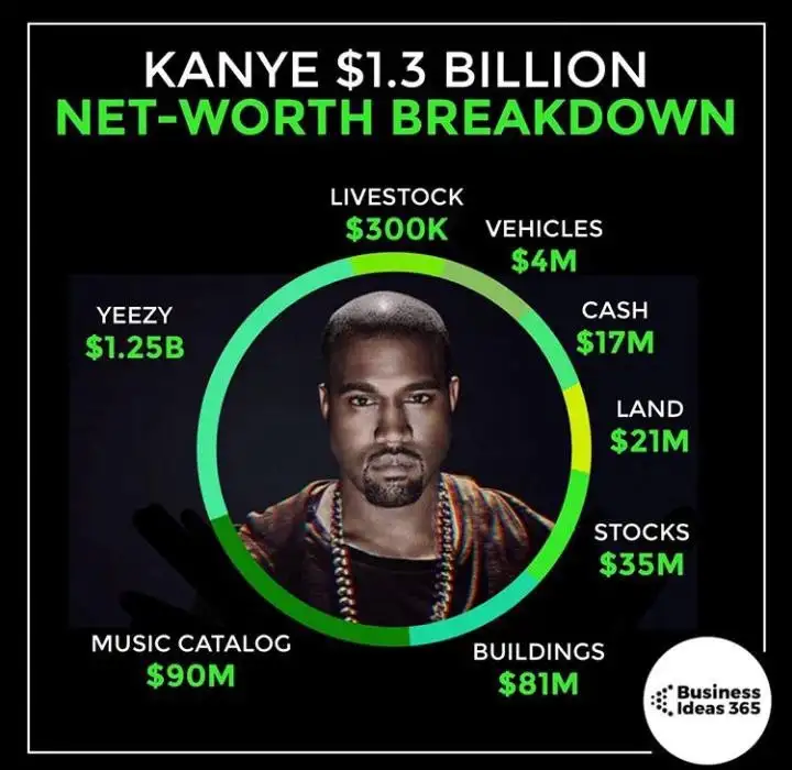
We’re not done with pies and doughnuts yet. Dave Pugmire found this gem of a circular chart. The circle surrounding Kanye West is split into portions representing the sources of his wealth. Some of the shades of green are difficult to distinguish, but this might be the chart’s saving grace because the proportions are completely wrong. Most people notice that the bars for livestock and vehicles are about the same even though one should be 10 times the size of the other. But the worst offender by far is the arc for Yeezy brand which is about a quarter turn even though the brand makes up the majority of the wealth.
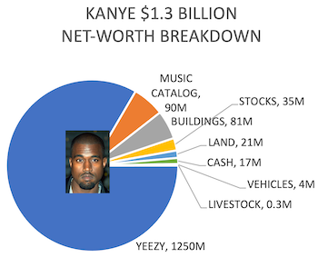
There, we fixed it for you. Well, at least the proportions are right. At the very least we can see the dominance of the Yeezy brand, which shows how devastating its subsequent loss was.
Squared Off
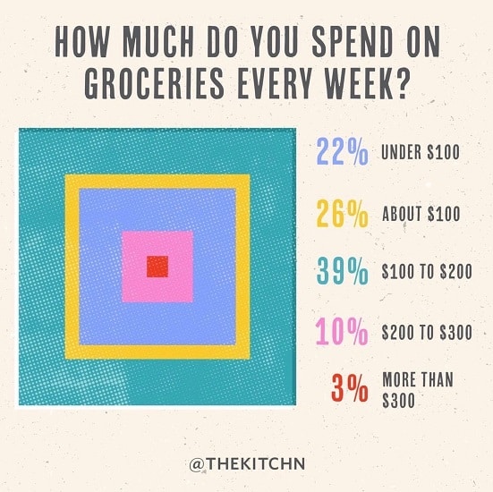
Pies and doughnuts are getting so boring. Why can’t we find a new way to represent proportions? Dave found this interesting example showing data as a, uh, quilt, we guess. Because, you know, quilts are so hip right now. And quilts always evoke the idea of buying groceries.
This unconventional display of data is problematic for a number of reasons. The approach is fundamentally poor because it is unclear what size attribute relates to the number they convey. Is it the width of each square, or the area covered by each color. Either choice is wrong as the relative sizes perceived are unlikely to be linear with either one. The designers did not need to worry themselves about that as the sizes are in no way proportional to the value. For example, the yellow value (26%) is in between blue (22%) and turquoise (39%), yet it is clearly thinner than either. To make things even more confusing, the legend order and embedding order disagree. The legend goes, from top to bottom, blue, yellow, turquoise, pink, and red. The concentric squares, from outside to inside, have the blue and turquoise reversed. Perhaps the squares are in order from largest value to smallest, but that is both confusing and unhelpful.
Problematic Crime
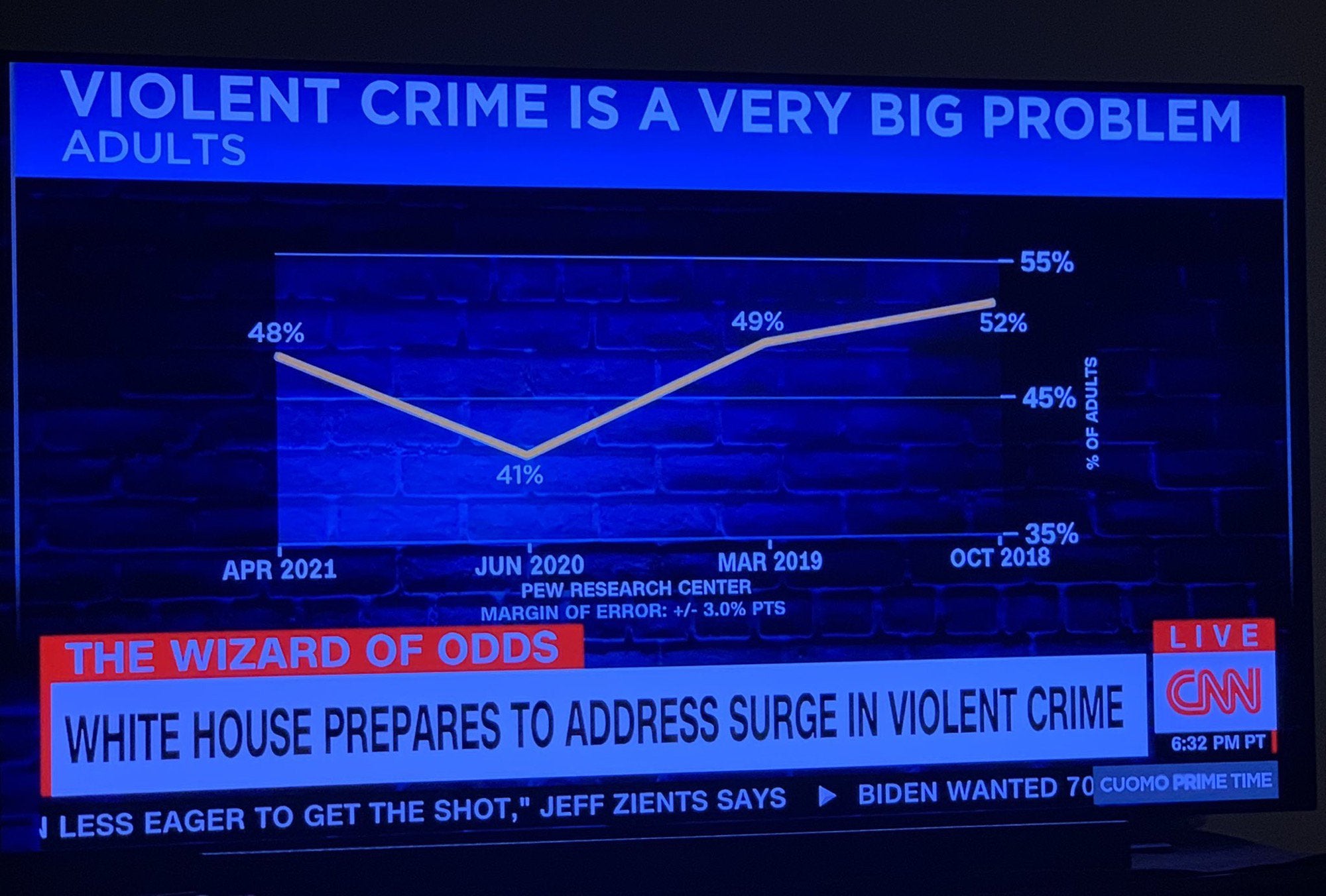
VisLies often features less than accurate charts presented by TV news programs. So it comes as no surprise that Ken found this gem posted on social media. At first glance, this plot seems innocuous. But the more you look at it, the more problems you find. Nearly every element of this chart is incorrect, and it might be the worst chart we have ever seen.
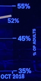
The first problem is the scale of the vertical axis. Rather than make the scale for the possible values, the scale is zoomed in on the range of the data. This makes the difference between values look large even when the difference is little more than noise. In this case, although it looks like crime has changed significantly, there is only an 11% difference between the highest and lowest values. Taking into account the error of the values (not properly shown in the plot but reported to be ±3%), the range could be as little as 5%.
As another observation, the one low value in the plot occurred in June 2020, which was at the start of the COVID-19 pandemic and the consequential lockdowns. So, having a drop in crime related statistics might not be unusual.

The horizontal axis is even worse. If we look closely, we notice that the time runs backwards! This makes upward trends look downward and downward trends look upward. Fortunately, the data are in a V shape, so the damage is minimal, but why?
To make matters worse, the distances between the values are inconsistent. The shortest gap is 5 months and the longest is 15 months. This uneven timing suggests there might have been cherry picking of the data (or at least laziness), and if it is necessary, the spacing in the chart should be consistent with the time.

The final problem with this chart is the title itself. The title claims “violent crime is a very big problem.” That may or may not be the case, but the data in this chart provides no evidence to support or deny this claim (even all the other problems were corrected). This is because the data is not about crime itself. Rather, the data is a poll on what people think about crime. Just because people think crime is a large problem does not mean crime actually is a large problem.
This is the most insidious lie of the chart. We have a circular argument where the news organization makes claims that convinces people of a topic (e.g. rising crime), and then uses the fact that they have convinced people on the topic as evidence, thereby constructing an argument out of nothing with no real evidence.
Slow Visualization
Inspired by Daniel Kahneman’s seminal work Thinking, Fast and Slow, [Bernice] considered what it means for a visualization to be fast or slow. Often when first viewing a visualization, a feature a quickly pop out: an upward trend, a cluster of items, one bar is taller than the other. Sometimes one quick look tells you everything you need to know about a plot. But often truly understanding data requires a slow analysis.
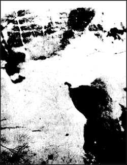
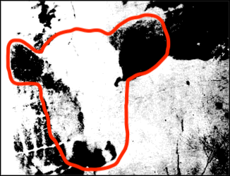
As an introduction to the idea of “fast” and “slow” visualization, consider this image. At first glance, it might look like a geo terrain. But, that is not it.

OK. We are cheating a bit. The previous image was rotated. Here we have rotated it to its proper orientation so that it is more fair. Even so, it’s still almost impossible to pick out the figure from the background if you have not seen it before.
Go ahead and take some time to see if you can tease out the proper form for the figure. If you are still having trouble, see this footnote.2
So, seeing this image is “slow”. But the interesting part is that once the figure is perceived, it will be easy to pick out at any time in the future, and thus become “fast.” This is an important lesson for visualization. Many techniques are difficult to learn (e.g., a log plot, parallel coordinates) but become automatic and powerful with experience.
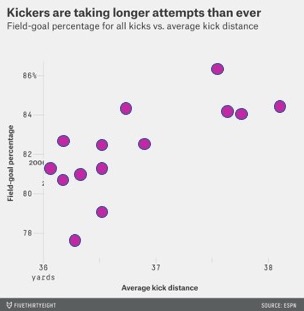
For a slow visualization, consider this simple scatterplot comparing the distance and success of field goal kicks in the NFL. Looking at this, you might get a quick impression. But if you spend enough time studying this, you will probably notice multiple features of the data. There is a clear positive correlation between the two axis. But you might also notice that there are two clusters that might suggest more of a bimodal distribution.
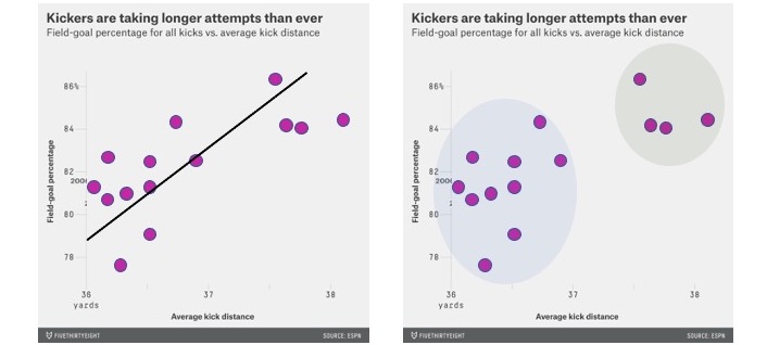
You may require “slow” visualization to see a particular relationship in the original scatterplot. But a visualization designer can use annotations to act as “fast” shortcuts. The left image shows a linear regression line to highlight the correlation. The right image highlights clusters. These move these visualization into the “fast” visualizations. But watch out! Engaging a “fast” visualization can affect how well we can analyze during the slow visualization. For example, when presenting the linear regression, a view may be less likely to notice clustering.
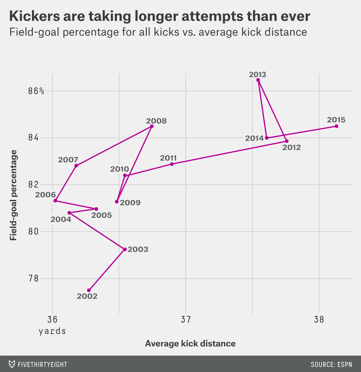
Annotations don’t have to add a “fast” visualization. Sometimes, they add depth and add some more “slow” visualization. For example, here is the actual annotation that came from the original source on FiveThirtyEight. This annotation might suggest an upward trend, but the trend is much more nuanced.
The line is connecting the entries in chronological order. If we follow the line, we might notice that the line generally goes up and then right. It appears that NFL kickers first got better, and then in response teams started kicking farther from the goal, which is harder but opens new opportunities for scoring.

The joy of slow visualization is learning more by viewing more. Such is the popularity of optical illusions like this hidden national leaders tree. The image is ostensibly a tree that has, hidden in the negative space, faces. Some of the faces are easily seen. But the more you look at this image, the more faces you can find. Can you find all ten?
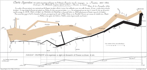
The best visualizations work the same way. The more you study them, the more you find and learn. Consider the famous infographic of Napoleon’s march created by Charles Minard. We won’t go into details on the features of this graphic; there are plenty of explanations available.3 What is so fascinating about this graphic is how much new information becomes clear the more you study it. How Napoleon’s army slowly dwindles as it marches toward Moscow. How the march ends not with a large battle, but simply giving up and turning around. How freezing weather completely decimated the remaining army. How deadly river crossings were. How meager the surviving army was.
When a visualization becomes so engaging, encouraging careful study, lying becomes more difficult.
For Further Reading
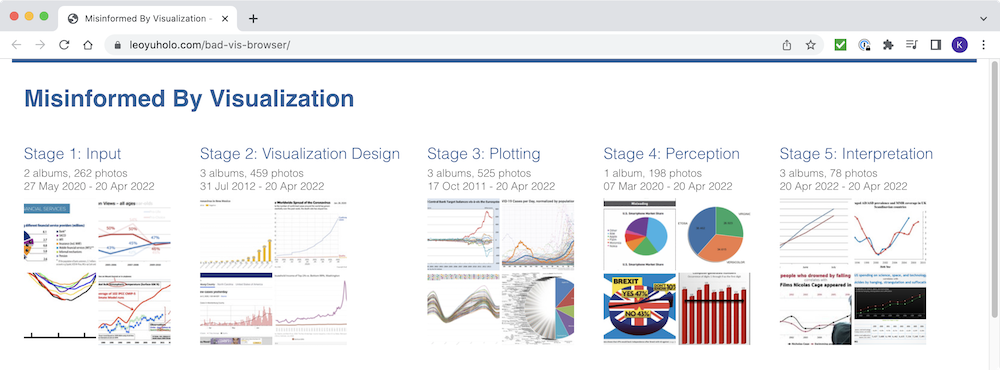
The last couple of years have brought some serious scientific research relevant to VisLies. The first of these is “Misinformed by Visualization: What Do We Learn From Misinformative Visualizations?” by Lo, Gupta, Shigyo, Wu, Bertini, and Qu. The authors collected a large corpus of visualizations marked as flawed on social media. They systematically sampled and reviewed these visualizations and propose a taxonomy to classify misleading visualizations. In addition to the paper itself, the authors helpfully make available a bad vis browser that readers such as ourselves can mine for VisLies. They also provide their whole flawed visualization corpus for an even deeper dive.
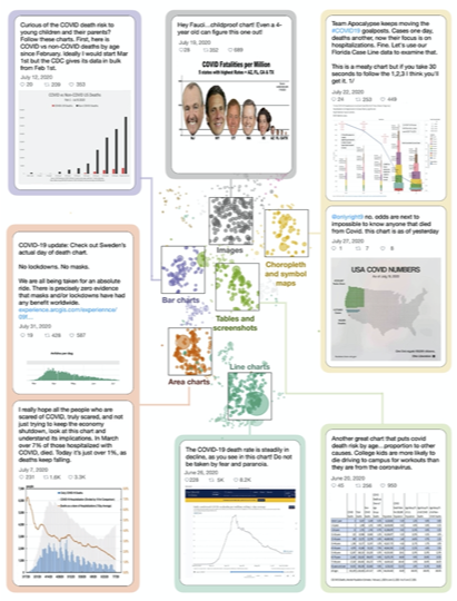
Another relevant publication is “Viral Visualizations: How Coronavirus Skeptics Use Orthodox Data Practices to Promote Unorthodox Science Online” by Lee, Yang, Inchoco, Jones, and Satyanarayan. This paper analyzes visualizations from Twitter feeds in “anti-mask” communities. The paper finds that, surprisingly, these communities respected and mimicked science principles while simultaneously rejecting the science community. There was a strong focus on data access and analysis as well as a promotion of correct visualization techniques.
At the same time, the forums rejected analysis from experts. This served to isolate the community from contrary positions and allowed them to ignore or reject contrary evidence. The end result was many compelling, but ultimately incorrect, visualizations.
-
We should point out that this plot of total pay has a vertical scale that does not go down to zero. This was done to make it easier to see the difference between the two line series. But note that, as we often criticize during VisLies, this also exaggerates the difference. ↩
-
It’s a cow. More specifically, it is known as the Renshaw Cow. If you are still having trouble seeing it, try looking at this image with the face outlined ↩
-
One source is this short video that describes the historic background and how it is represented. ↩