VisLies 2020 Gallery
October 27, 2020
Thanks to the COVID-19 pandemic, we had to hold VisLies as virtual meeting this year. Although we always enjoy meeting each other in person, we were still able to have a great VisLies session. We had probably the largest group ever, with around 75 people consistently participating. Attendees spanned the globe from Australia to the U.S. to Europe.
Unfortunately, due to a snafu, we don’t have a record of everyone who presented this year, so our gallery is a bit incomplete. If you remember presenting something, send us a note to vislies2020@vislies.org so we can add your contribution.
Early Panic
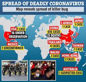
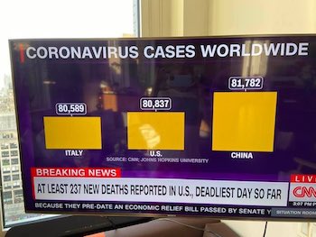
It is no surprise that visualization lies about COVID-19 were a common theme this year. Ken Moreland started by presenting this early infographic about COVID-19 from an article in the Sun from late January. At the time, the disease was mostly constrained to China, but was beginning to spread around the world. This was definitely a bad sign, but this graphic makes it look like the pandemic had already taken hold around the world. If you look at the numbers, you see that all countries have only 1 or 2 cases, but are labeled the same as China with hundreds of cases.
But by far the biggest what the heck about this graphic are the black labels. The black label for China is about the number of deaths. But the black label on the U.S. is just about potential infections. The similarity of the label design suggests that they are to mean the same thing, but you cannot get more different than a person confirmed dead and a person who may or may not have gotten sick. It is a cheap trick to make the spread seem much worse than it actually was (at the time).
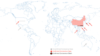
Ken provided this “corrected” version of the graphic. In this graphic, each case is represented by a dot. This shows the proportional amount of infections (total, not per-capita) in different parts of the world.
One issue with a display like this is that for a country with a small number of infections (for example 1), it can be difficult to see or notice. There is a big difference between 0 and 1 infections. To make it more clear in what countries infections have occurred, an arrow is provided to highlight the country.
Downplay the Threat
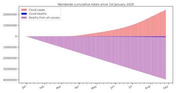
Whereas some exaggerated the threat of COVID-19, others downplayed it. Ken presented this plot comes from an article from Swiss Policy Research. This plot purportedly demonstrates the deadliness of COVID-19 by comparing the disease’s deaths to all other deaths. According to the visualization, COVID-19 deaths look insignificant. But there are several things this plot does to minimize the apparent COVID-19 deaths.
First, although there were some deaths in China early on, COVID-19 did not really start taking off worldwide until 2-3 months into the year. Given that this plot is only for the first 8 months of 2020, this means that the total deaths are counting deaths for nearly twice as much time.
Second, it’s not clear how accurate the data is. The source does not make it clear how these data were collected (other than total deaths were interpolated from “Our World in Data” figures). Counting COVID-19 deaths is tricky, and how you count can affect the size. So it is important to describe the source of this data. For example, both the CDC COVID-19 count and the Our World Data COVID-19 count use excess mortality, which shows a much more significant percentage of deaths.
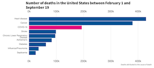
Third, compared to total deaths, most of the worlds deadliest problems look small. Take, for example, this recent plot from a USA Facts article shows that in recent months COVID-19 is the third largest killer, above diseases such as stroke and diabetes. It is hard to argue that stroke is an insignificant disease. Granted, the COVID-19 death rate in the U.S. is higher than the world as a whole, but representing the disease as insignificant is not honest.
Change of Scale
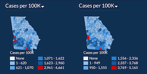
We all want to feel like we are doing well with handling the pandemic. Sometimes this leads to the fibbing of some data. Bernice Rogowitz presented these choropleth maps provided by the Georgia Department of Public Health. The left map shows the number of COVID-19 cases, per county, in June (on the left) and July (on the right). The two maps look quite similar, and one might be lead to believe that the spread of COVID-19 us under control. But a closer look reveals that the scale of the colors has changed. Note that the largest number of cases in June is 4,661, but this jumps by about 500 cases to 5,165 in July.
(It should be noted that the Georgia Department of Public Health has since fixed the problem.)
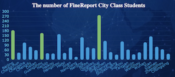
Change of Order
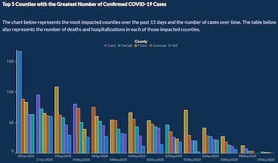
The Georgia Department of Public Health’s troubles with data display didn’t end there. Bernice also showed this bar chart showing a sharp downward trend of new COVID-19 infections. Or at least it seems that way. If we look more closely, we see that the bars are written out of order. Rather than being displayed in chronological order, they have been resorted from highest to lowest bars, making the decline look much steeper than it actually is. To reinforce this, the bars for the counties are also reordered in each group. A graph with a corrected order shows a much less dramatic trend.
Whereas readjusting the scale is a simple error to make by mistake, it takes some work to mangle the visualization in this way.
Friendly Neighborhood Poster

While traversing her local area Maria Zemankova came across this poster outlining COVID-198 restrictions. Overall, the infographics are clear, but there are some strange elements to it. At first glance, it looks like all is bad. But in fact, two items are recommended whereas two are prohibited. The problem is that a check mark and a cross are actually visually pretty similar. This graphic could be made instantly clearer by using green (a color commonly associated with “go” in the US) with the check and other associated visual elements. This is not a case of simply saving money by using only red and black ink. The printers used are capable of full color as is evidenced by the blue logo, present even in the printed poster.
The part of the infographic telling us not to gather in groups is clear enough. However why is there a large X over a person drinking (water?)… alone… in an outdoor open space?
Inconsistent Statistics
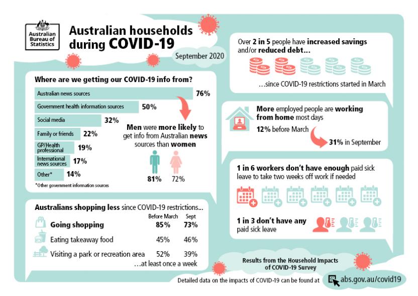
Ben Simons presented this graphic from the Australian Bureau of Statistics. In particular, Ben points out this box containing some simple statistics about the amount of sick leave available to Australian workers. The box states that 1 in 6 workers don’t have paid sick leave while 1 in 3 works don’t have any sick leave.
Wait. So only 1/6 of workers don’t have 2 weeks of sick leave while 2/6 (i.e. 1/3) workers have no sick leave. That would mean that 1/6 of workers have no sick leave but somehow enough sick leave for 2 weeks paid vacation. That makes no sense.
Clearly, the statistics must mean something else, but we cannot figure out what that would be.
Corona at the Bar
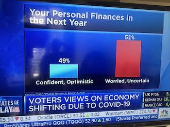
Nothing says deadly virus like bar charts, and oh boy have we had some. A trick we’ve talked about many times at VisLies is to punctuate your point by zooming your scale to accentuate differences, and Ken showed this pair of examples. In both cases, the values the bars represent are within 2% of each other. Although the numbers are almost the same, the bars make one look unreasonably larger than the other.
The example on the right has a second problem. Note that the title says that voters views are “shifting.” But the plot shows no evidence of shifting. To show shifting, you have to show data changing over time. This is just one snapshot. There is no evidence show to show the data have changed or stated the same.
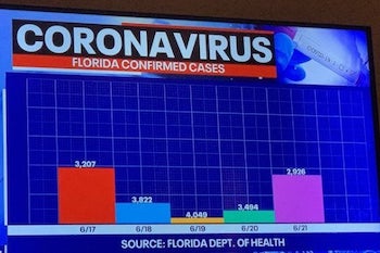
As bad as the scaling was in the previous examples, at least the height of the bars have some sort of relationship with the values they represent. In this chart, the height of the bars has nothing to do with the the values they represent. Note that the smallest bar, the yellow one, has the largest value. But the smallest value is not the tallest bar.
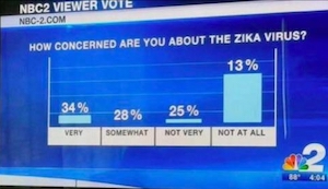
But why should COVID-19 have all the fun? Here is an earlier example of the same issue for the Zika virus.
More than a Whole
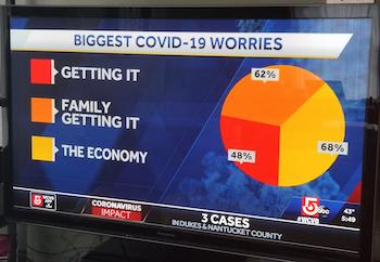
It seems like it wouldn’t be a VisLies if we didn’t spend some time trashing bad pie charts. What is it about pie charts that makes people do them so wrong? Apparently here someone was so worried about COVID-19 that they managed to get way more than 100% of the worries there. Here’s a tip: if the number’s don’t add up to 100%, you’re using it wrong.
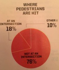
This misuse of pie charts abound. Here is a pie chart of car accidents involving pedestrians. The first weird thing about this chart is that there is “at an intersection,” “not at an intersection,” and “other.” What is “other”? What location is neither at an intersection nor not at an intersection? Additionally, the values add up to 104%. I’m not a statistician, but that seems weird. Maybe 4% of pedestrians are hit in an intersection, get knocked out of the intersection, and get hit again.
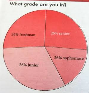
Here is a final example. I’ll let this chart speak for itself. Not only does this graphic not understand how pie charts work, but it doesn’t really understand how math works.
Questionable Advice
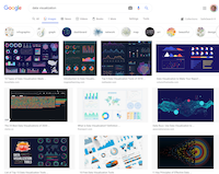
Out of curiosity, Bernice looked up “data visualization” into Google. If someone wanted to learn something about proper visualization, I likely place to start would be a search like this. Thus, it is interesting to see what sort of advice is given at the top of the list.
One would hope that the top advice from Google would be well thought out. Although the top images are aesthetically pleasing, there are some questionable design choices.
Take for example this chart. Generally, bar charts are an effective way to represent data. But there are some questionable choices here. The background looks nice, but why is it showing Africa and the Middle East when the data are about China? The rounded edges of the bars might be aesthetically pleasing, but they make it more difficult to determine the apex of the bars. The bar labels, while readable, are cramped and it is difficult to tell which label goes to which bar. And the bars are in alphabetical order, which has little to do with the data. Why not order the bars in, for example, bar height? That would make the distribution more clear.
This chart looks nice, but is it the best example we can give?
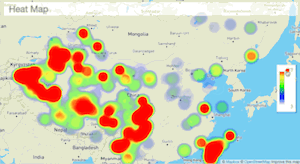
Here is another example Bernice found. The example shows a heat map being dynamically adjusted by changing the range. But the interaction seems wrong. The slider shows a narrowing of the range by removing the higher values. But the display seems to be removing the lower values, not the higher ones. And it also seems that the colors in the display are being readjusted by the new range, but the colors in the range selector are not also being updated.
In short, there are probably better examples of interaction to show to new developers.
Pyramid Scheme
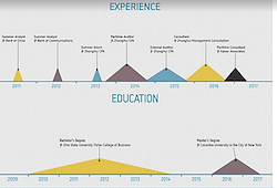
Speaking of form over function, Bernice also came across this interesting suggestion to show experience and education on a résumé. It is an interesting idea: Showing experience as a graphical timeline rather than a list of dates. But the choice of representing time ranges as triangles is rather odd. Although the pyramid skyline looks nice, it seems to suggest that each experience ramps up and then ramps down, suggesting that the majority of the work happened in the middle. This is almost certainly not the case. Bars would likely be a more appropriate use in this case.
Pie to Go
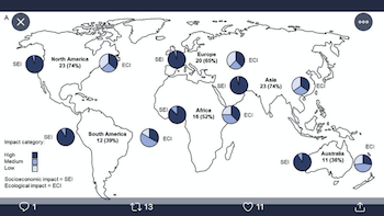
Bernice also provided us with this fun example of a visualization that breaks the basic Gestalt principle of proximity: place related objects near each other. Here in this plot we see a global map where each continent is labeled and has associated pie charts. The problem we see is that the pie charts are spaced so widely and strangely that it is sometimes difficult to tell which chart applies to which continent. Plus, two types of pie charts are used with identical visual styles. Given enough time, one can parse out what data goes where, but data flows better if it is not a struggle.
Perfect Speed
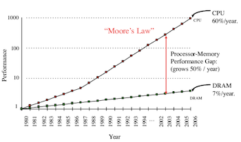
Ken presented this plot after seeing it in multiple publications. It is bothersome because it doesn’t look quite right.
These slopes are remarkably straight. Suspiciously straight. That’s a warning flag that there is likely a lot of data that is getting aggregated (at best).
But the real “what the hell?” aspect of this plot is this gap in the x axis In the middle of these perfect straight line, there is a seven year gap that is removed from the plot. This cannot be right.
A more trustworthy example can be found in Computer Architecture: A Quantitative Approach (fourth edition, page 289, Figure 5.2).
The Tall and Short of It
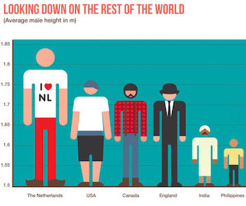
This figure falls into the trap of resizing both width and height when the data is only proportional to height. A worse problem, though, is that the baseline is at 1.5 meters (almost 5 feet). It makes the Filipino shorter than the Netherlander’s leg.
Mismatched Icons
![]()
Using icons to represent the location of things of a particular type is a common, and valid, practice. But this legend shows the weirdest looking turkey we have ever seen.
If you want to confuse people, an easy way to do it is use conflicting information, and this odd scheme does just that.