VisLies 2023 Gallery
Taking VisLies down under this year, we had a great crowd and a lot of good lies introduced.

Plummeting Up
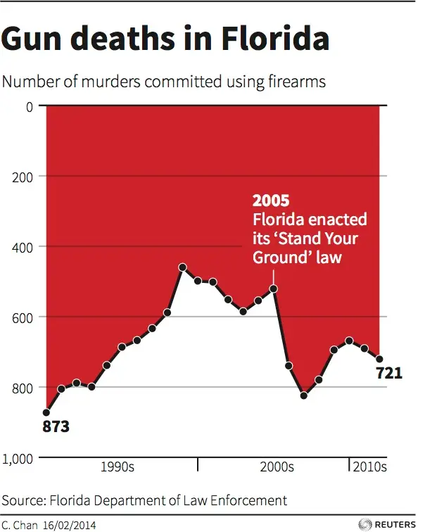
Ken Moreland starting things off with an example of one of the most misleading visualizations accidentally created. This plot shows the number of gun murders each year in Florida and highlights a time when a “stand your ground” law was enacted. A stand your ground law increases the circumstances in which a citizen is allowed to use deadly force. Advocates argue that such laws lead to an overall drop in crime. This plot seems to support this argument as there is a sudden drop after the law is created.
But take a closer look. There is something curious about the vertical axis. The 0 mark is at the top of the image, and the values go up as you go down the page. So, the number of murders is not going way down, it is going way up!
Since its construction, this chart has been discussed numerous times on social media as well as in several blog posts (1, 2, 3).
Although misleading, this chart was created with good intentions. The concept is that people usually identify up as good and down as bad. More murders is bad, so the axis was flipped. A recent published study investigated this idea. What they found was that although it is easier to interpret graphs where large values are associated with “good,” simply flipping the axis does not work. The confusion of inverted values overrides any benefit.
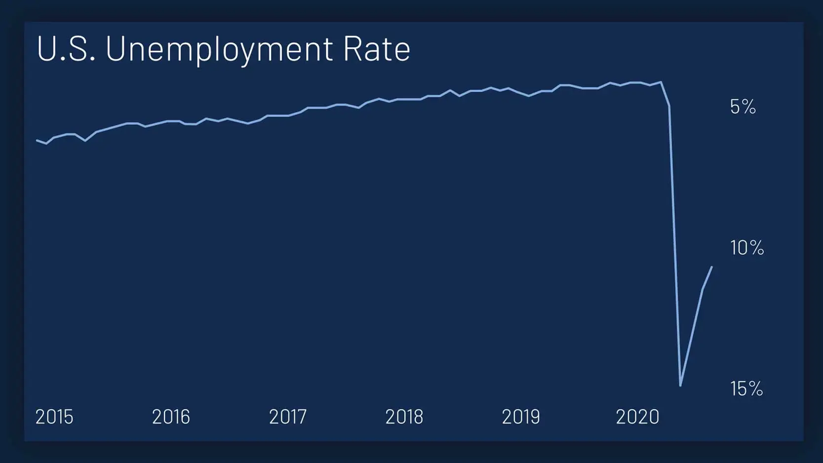
Unfortunately, this plot is not unique in its axis inversion. Here is another example where the unemployment rate seems to take a big dip during the COVID-19 pandemic.
Off by One (Hundred Million) Error
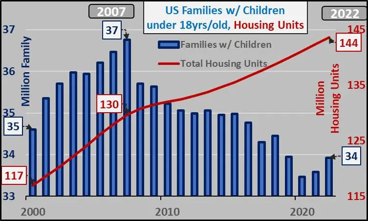
Next, Ken found this graph in a subreddit about real estate bubbles. The chart was posted under the provocative title “Why isn’t this one of the biggest stories out there???” At first glance, the chart seems to justify some scrutiny. The chart shows that since 2007 the number of U.S. housing units has been going up while the number of families has gone down leaving a huge gap of apparently empty houses. Bubble indeed!
However, a closer inspection reveals some problems with this graph. We can ignore a few things like imprecise numbers and non-zero axes, which are not dramatic. The really weird thing about this graph is the fact that there are 2 vertical axes. The blue left axis is labeled “Family” and the right axis is labeled “Housing Units”. Why do these two counts each need their own axis? And why are they so different? Are there really 144 million housing units but only 34 million families to put in them? How can there be over 100 million surplus housing units, and if there were why would we keep building them?
The answer lies in the legend. Look carefully and see that the families is qualified by families that have children under 18 years old. This leaves out a huge swath of the population. It excludes any adults that do not have children. It also excludes anyone with grown children (whether or not they still live with their parents).
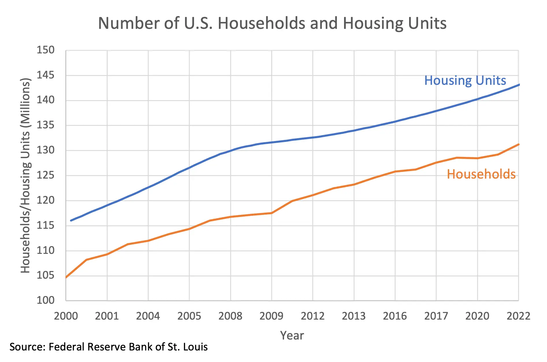
The proper unit to use is households, which comprises a group of people living together as one economic unit. The corrected plot here shows the number of housing units compared to the number of households (now using the same vertical axis and zoomed in to show detail). We can see that the two track each other closely. (In fact, there is a slightly smaller surplus of housing units in 2022 than there was is 2007.)
So, is the behavior of the family trend in the first graph just noise? No. This is likely caused by the tendency of birth rates to go down during a recession as potential parents put off having children for more favorable conditions, and the recession that started in 2007 was no exception.
Too Many Axes
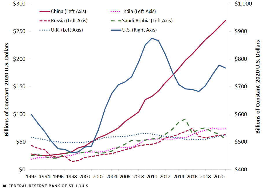
Speaking of incomparable double y-axes, Ken found another strange example from a Federal Reserve blog post (and subsequent tweet). This plot shows the total military expenditures from 6 nations. It shows high but fluctuating US spending and an increasing spending from China that eventually surpasses everyone. But does it?
You may notice that there are labels on both the left and right axes. They do say the same thing, so it’s really just the same axis duplicated to see the measures better, right?
Wrong! Look at the scale and see that there are different numbers on each one. How can the same measure have different values? Once again the answer is in the legend. The legend label of what each series means also states which axis, left or right, the series should be read from. In fact, all the series are on the left axis except the US. You can’t see it with this display, but the US spending is much larger than any other country.
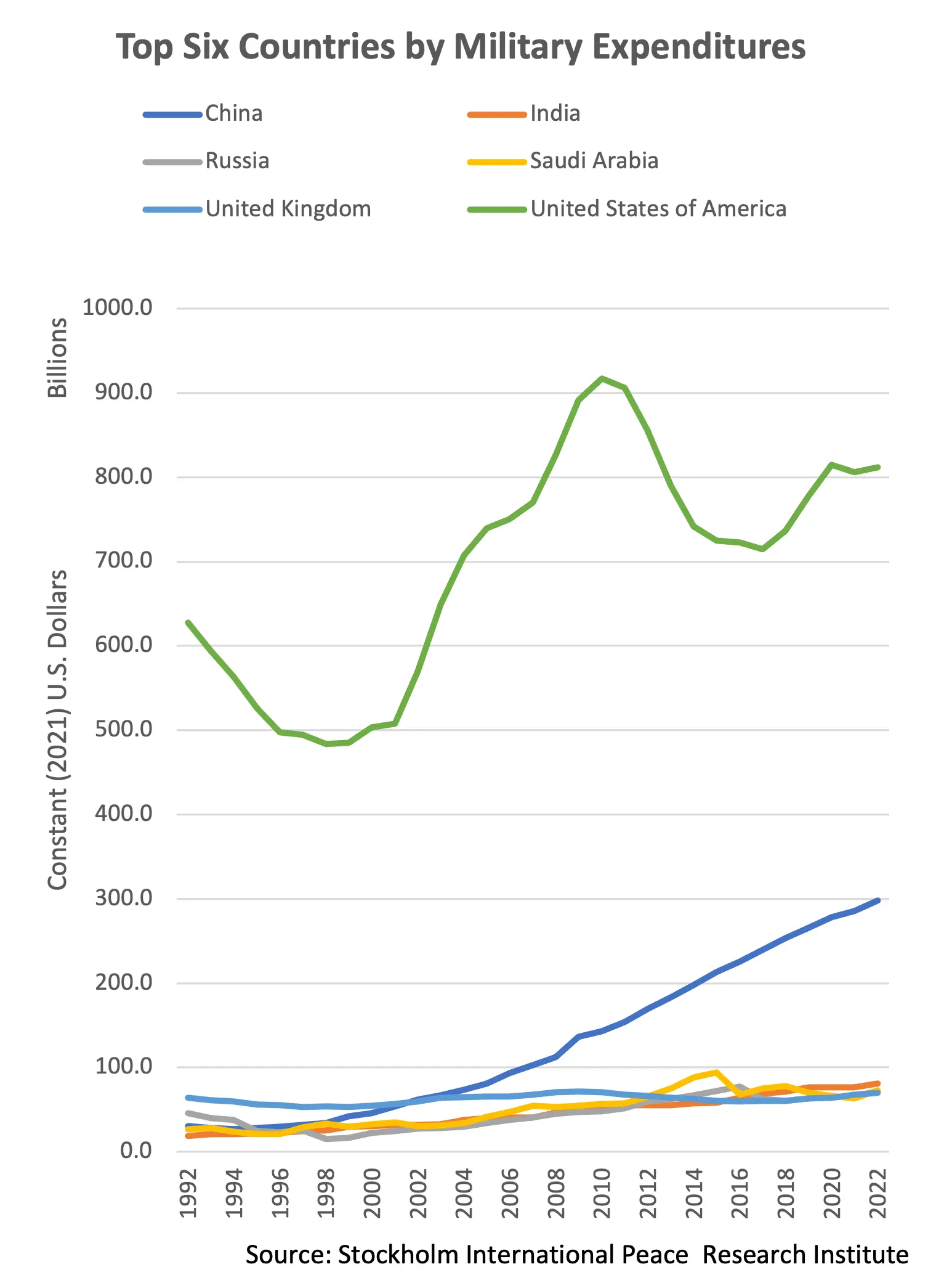
Here are all the series with the same scaling. It can be seen that the US spending is far and away from any other country. It is more that 4x larger than its nearest competitor. This is a story all on itself.
The original image was clearly constructed this way to demonstrate detail for all the series. In the corrected plot, all but the top 2 spenders blend together. However, this is a very confusing way to show this detail. A more straightforward and clear way is to simply provide a second plot showing all but the US. In fact, the blog post already has this, making these visual gymnastics completely unnecessary.
The St. Louis Federal Reserve twitter account updated their tweet to acknowledge that the plot is problematic. They didn’t fix it though. They just encouraged people to read the blog. I guess that’s one way to get people to read it.
Too Few Axes

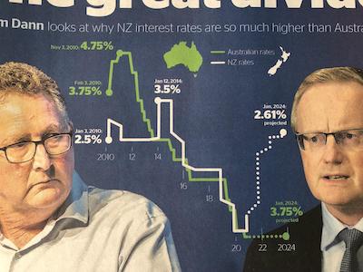
Speaking of the number of vertical axes, Ken followed up with this advertisement for the NZ Herald goes the other way and decides that it doesn’t need any y axis. This results an interesting chart, but confusing.
The most confusing part of this chart are the rightmost 2 numbers. Somehow in this graph, 3.75% is less than 2.61%. That said, this is probably a typo or copy/paste error from the left side. The actual value is probably close to 0, but another peril of not having a reference axis means that it is impossible to tell.
The typo not withstanding, there is another problem with this chart. The title does not match the data. The title says, “Liam Dann looks at why NZ interest rates are so much higher than Australia” (emphasis ours). But at the time the data was captured, the interest rates are about the same (and pretty low). The difference comes from the projected interest rates. Regardless of how these predictions were made, they are still just predictions. It is not the state of the current world, and this future may never come to pass. It is disingenuous to state something exists just because you think it will eventually happen.
Chicken Vis
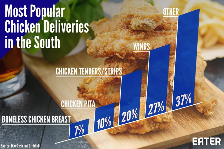
Bernice Rogowitz was hungry for vis lies. She started with this visualization of chicken deliveries. The visualization shows a simple statistic in what is ostensibly a bar chart.
The decisions of this chart, however, are questionable. Rather than place the bars on a horizontal line, the entire chart is skewed at an angle, which makes the whole thing harder to read. The bars helpfully have the percentage value for each. It is a little weird that the numbers add up to 101%. This is probably a roundoff error, but not very comforting.
The chart also hits a pet peeve of Bernice’s: why is the “other” category so much bigger than the rest? A third of the data is grouped in that other bar. What is hiding in the big bar?
When Vis is not a Vis
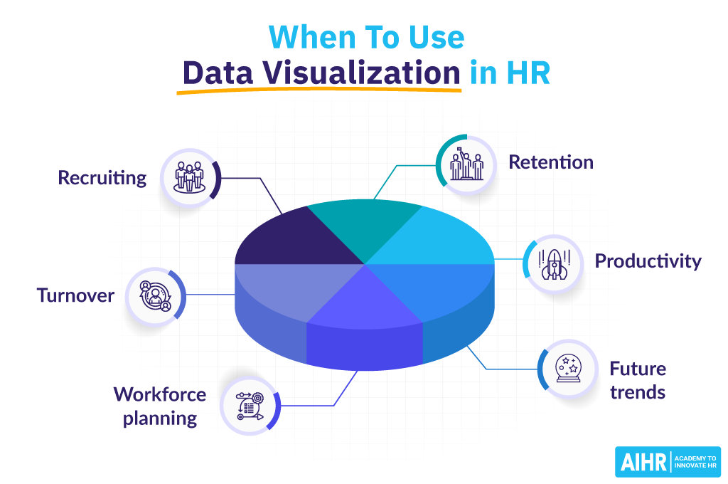
Riddle me this, liars: When is a chart not a chart? This is the conundrum Bernice faced when she found this visualization on a blog about data visualization. At first glance, this appears to be a common pie chart showing six quantities.
But on closer examination, there are no quantities. What we see are 6 items, but there are no values associated with them. Rather, this is simply an unordered list of things. When presenting a graphic that clearly indicates a pie chart, it is confusing to break the metaphors of that chart. It is particularly ironic that the very graphic is about data visualization but in fact has no real data visualization.
More Than a Whole
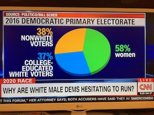
Joe Insley was watching TV when he came across this choice example of a pie chart. Right away we can see something is suspect when then green wedge is marked as 58%, but the wedge is clearly less than 50% of the pie.
So, it comes as no surprise that the proportions add up to more than 100%. The obvious problem is that this chart breaks the basic metaphor of a pie chart. These items are not parts of a whole, which makes the pie chart completely inappropriate. News outlets really seem to like abusing pie charts like this. (Exhibit A. Exhibit B. Exhibit C.)
We also observed that the categories do not seem very systematic. Sure, non-white and female voters might not relate to white male candidates. But are college-educated white voters particularly resistant to white male candidates?
And we are not sure if there is anything to be read into the fact that the word “women” has the only lower-case letters on the entire screen.
Who Cuts a Pie Like This?
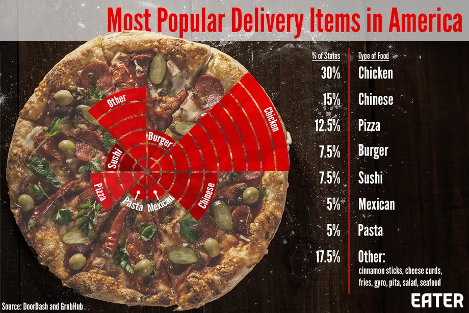
Back to food, Bernice presented this pizza pie chart on food deliveries. It is a (literal) pie chart, and the data fits the pie metaphor of parts of a whole. As an added bonus, the values of the categories actually add up to 100% this time.
But something does not look right. If we look at the biggest wedge, chicken, we expect the wedge to take up 30% of the pie (nearly a third), but it actually only takes up an eighth.
Even though the chart is set up both figuratively and literally as a pie chart, it is not a pie chart. It is not clear how data values are represented, but they seem to be related to the number of bars emanating from the center. If we take each bar to mean 3%, that is pretty close to the actual values listed. However, that is remarkably imprecise. To make matters worse, the inner bars are much shorter than the outer bars, thus taking up less area of the screen. This skews the representation to make big values seem bigger.
Worst of all, that is a very unappetizing looking pizza.
An Eye Chart
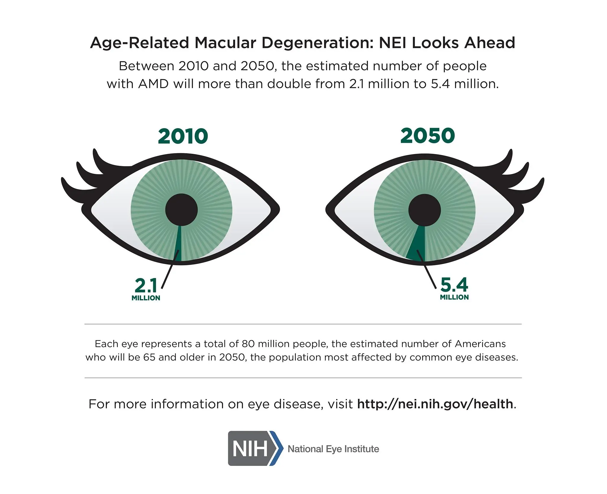
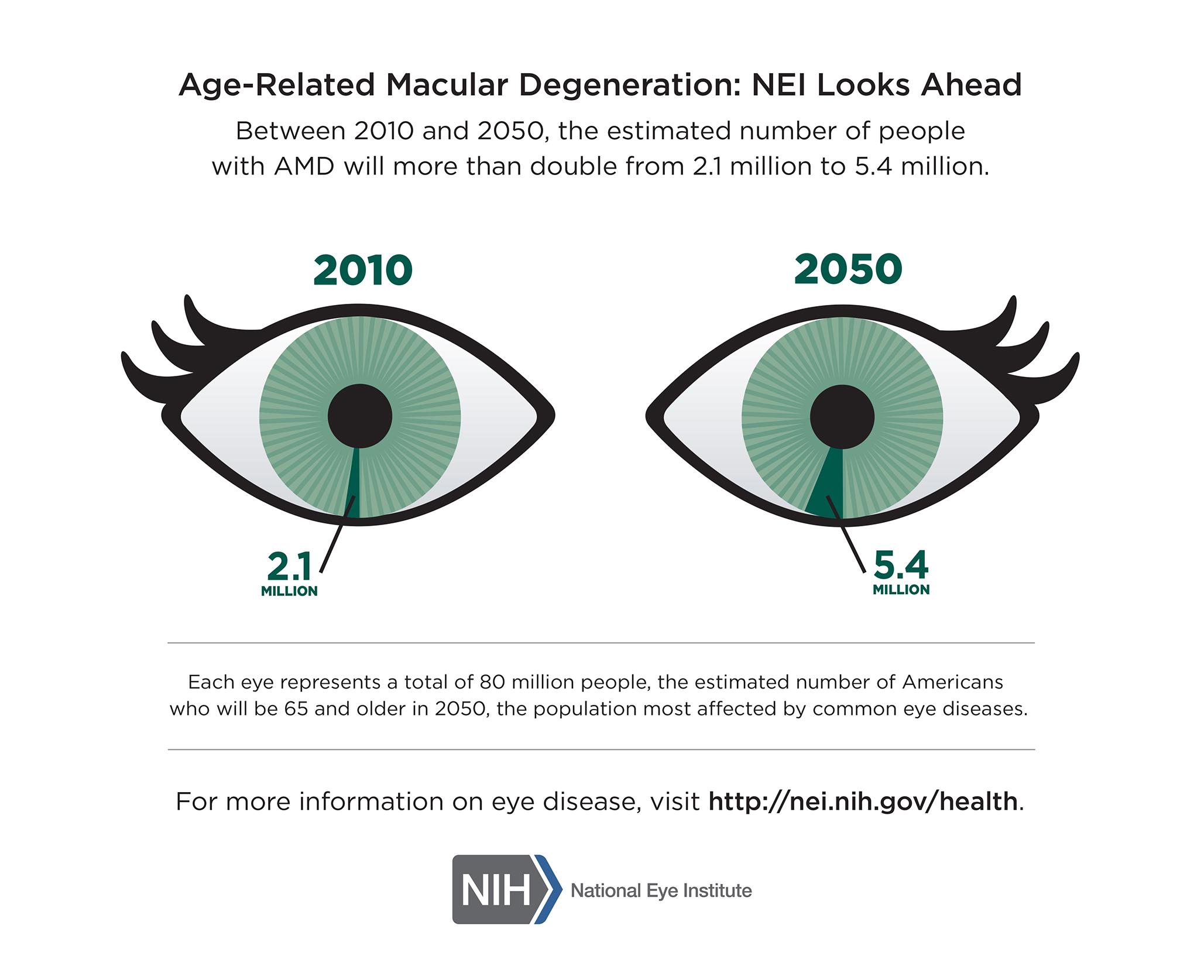
Bernice found this infographic from the NIH warning about an expected increase in macular degeneration. Although the sentiment is worthy, we identified numerous problems with the graphic.
We note that the numbers given in the graphic (2.1 million for 2010 and 5.4 million for 2050) are absolute numbers. Sure, the second number is more than double the first. But if the concerned population proportionally doubles with it, the chance of a person having the disease does not really change.
The chart seems to fix this problem by showing the numbers as a proportion, but it actually makes the problem worse because the proportions are wrong. The chart is using the population estimate of 2050 (80 million) for the proportion of people in 2010. That is just wrong.
Using a proper estimate of people over 65 in the United States in 2010 (40.1 million), the number with macular degeneration was about 5.2%, which is about twice as large as it appears in the diagram. In contrast, the 2050 estimate, by the numbers provided here, is 6.75%. It is a bit more than 2010, but not nearly as much implied by the graph.
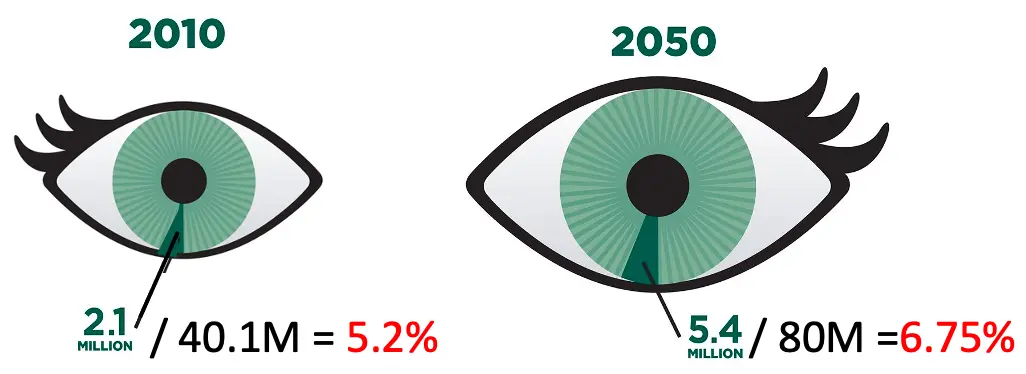
Bernice proivdes this corrected version of the chart. The proportions are now much more realistic. As an added cue to the change in the overall population, Bernice also adjusted the relative size of the eyes to be proportional to the concerned population.
Bernice also notes that although the use of irises as the graphic pie charts is, shall we say, eye catching, the iris is not where macular degeneration occurs. Macular degeneration is a condition of the retina on the inside and the back of the eye.
Representation Matters
VisLies is all about the representation of data and how it can skew the facts. That is because representation matters, and sometimes subtle changes make a difference. Bernice demonstrated this with a recent study that she briefly summarized. The study showed subjects plots of the same COVID data plotted in different ways like the variants shown below.
| Compared to Others | Scaled to its Own Range | Scaled to Group Range |
|---|---|---|
 |  |  |
 |  |  |
Results showed that a simple change like the scaling of data changed the participants’ feelings for their safety. These are the same perceptions used to make decisions by policymakers and individuals.
Lay Off the Bubbles
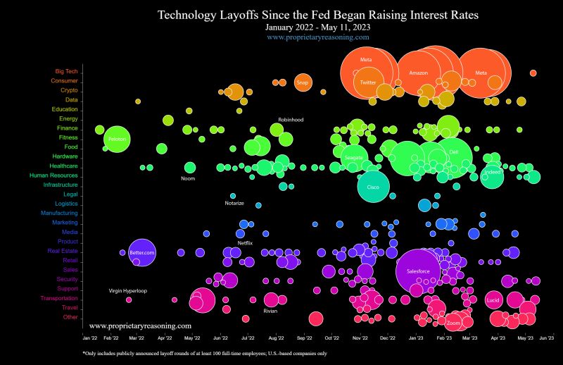
Harith Rathish encountered this interactive visualization of technology layoffs since recent federal interest rate raises, which he found from a LinkedIn post. As described in the post, the chart represents a round of layoffs by a specific company as a bubble. Each bubble is color coded by subsector and sized by the number of employees let go.
We found numerous issues with the representation in this diagram. To start, the size of each layout is represented by area. But area is not a great way to represent a quantity. Our perception of area does not scale linearly with area; people tend to underestimate the area of shapes as they grow. There are methods to compensate for the appearance of area. We cannot tell if such compensation is used here, but even so the apparent area still has lots of variability. We recommend avoiding using area to represent quantities when possible.
We also find the colors fairly ineffective. Many of the colors are difficult to distinguish. Granted, with 27 categories it is nigh impossible to produce easily distinguishable colors. But the problem could be mitigated by giving similar colors to similar categories. Instead, hues are simply assigned to an alphabetic list of categories. Consequently, “Human Resources” has an almost identical color as “Healthcare” but is completely different from other subsectors providing services for businesses like “Logistics” and “Marketing.” The colors would be more effective if related sectors were grouped with similar colors.
But the biggest problem with this visualization is that it implies that the rising interest rates are causing increased technology sector layoffs. Although the visualization does seem to show a general upward trend of layoffs, it completely fails to demonstrate this conclusion. It is lacking in at least three critical ways.
First, it cannot show that technology layoffs increased after the rate increases of March 2022 because it does not show the data before January 2022. Unless you show that there were many fewer layoffs in the time leading up, you cannot conclude that they have risen.
Second, the implication that the technology sector was disproportionately affected is not established. Is this a trend only in the technology sector, or is it a general economic trend with layoffs happening in many sectors? Other sectors would have to be shown in comparison.
Third, and most important, despite what the title says the visualization does not establish a correlation, let alone a causation, between interest rates and layoffs. They are just two single events that happened at the same time. But the title could just have easily said that tech layoffs rose after Russia began their long invasion of Ukraine or rose after the U.S. House began investigating Donald Trump’s handling of classified documents or since Florida passed their “Don’t Say Gay” education bill. We have no reason to believe that any of these events are related to tech layoffs, so why are interest rates necessarily related?
It’s in our DNA
Alex Kouyoumdjian brought up a pet peeve of his. Start by Googling images of DNA. Likely, you will get a search filled with images like these.


These images show DNA as squishy, lumpy, or bumpy. They look realistic and organic, and they often come from what we should consider trustworthy sources. (These images come from Penn Medicine, the University of Oxford, and Science, respectively.) They all have the double helix we all know makes up the shape, but the truth is that these are completely inaccurate depictions of DNA, and in fact they misrepresent its very nature.

So, what does DNA actually look like? Well, the size of DNA is smaller than the wavelength of visible light, and so it cannot be seen in the traditional sense. But DNA is a molecule that can be described in terms of the atoms it comprises, as shown here. Note how different this structure is from the images above. Even those bumpy images that might be comprised of spheres are constructed in no way related to the actual configuration of DNA. Sure, the representation of a molecule can take some creative liberties of what it “looks” like, but the underlying configuration should be correct.
To be clear, there is no problem with simplifying the representation or using symbolic notation. Both are done on this good example here to help understand the structure of the molecule. The problem comes from these hi-res, detailed, and realistic-looking pictures that people could easily mistake for electron microscopy and think, “Wow, I’ve never seen such detailed images of DNA before. Who knew it looked like that?” Well, it doesn’t, and we expect better from medical and biology publications that know this.
Picking Rotten Cherries
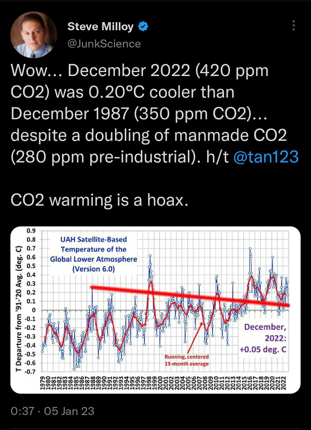
Wow… We’ve seen plenty examples of cherry picking at VisLies, but have we ever seen anything as brazen as this? It’s one thing to cheat the data by picking only those items that support your narrative, but it is another to show how you cherry picked the data among the rest of the data that completely invalidates your point.
To make it clear what is wrong here, ignore the obtrusive straight red line Steve Milloy has drawn across the graph. The graph shows the average global temperature as measured in the lower atmosphere. The blue dots are the measurements for each month. As to be expected with any weather-related measurements, there is a lot of noise and fluctuation from month to month. There is a second red line smoothing out the data to give a better indication of longer trends. In any case, it is clear to see that the values on the left side of the graph are generally lower than those on the right.
Despite the clear indication that the data shows the opposite of what he wants to say, Steve Milloy picks two specific measurements that suit him and throws away the rest. These two points are not representative of the rest of the data. The first measurement, from December 1987, is a complete anomaly being warmer than any other measurement in over 10 years either way. The slope of the connecting line has nothing to do with the trends of the collective data.
This is one of those times where we know a VisLie was intentionally created to mislead people. We’re sure Steve Milloy can’t be that stupid.
Well, pretty sure.